The Beefeater, Big Ben and the dome of St Paul’s are all icons of London recognised by everyone. But there’s another icon of the city that every Londoner knows, though perhaps they don’t think of it that way – the Underground map. Look at one of the early tube maps and what you’ll see is an unstructured mess of lines like a plate of coloured spaghetti or a piece of crochet destroyed by a pet cat. It wasn’t until graphical designer Harry Beck took it in charge that we got the rational, sleek layout of the modern tube map, where every line runs vertically, horizontally or at a 45 degree diagonal, a bit like an electrical circuit diagram. It’s instantly recognisable; you can even get t-shirts with the tube map printed on them.
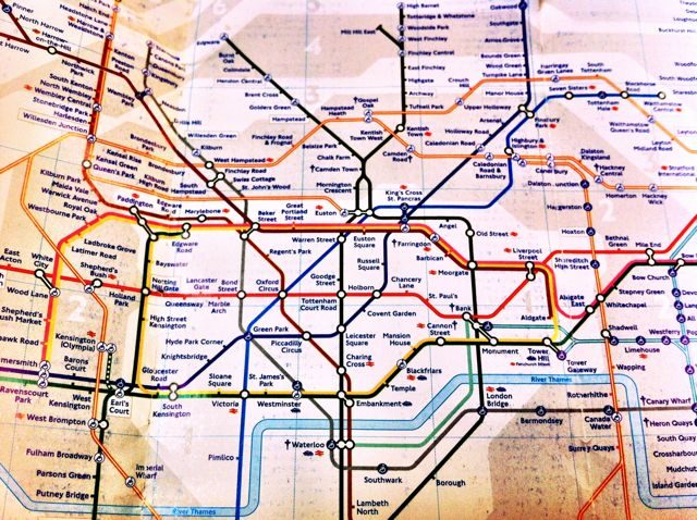
The British Waterways Board has done a ‘tube map’ style chart of London’s rivers and canals, the buses have pinched the idea and Amsterdam’s GVB even gives credit to London Transport as the inspiration behind its own map.
It really is part of the culture and Londoners love their tube map. In 2009, the River Thames was removed from the map – an immediate outcry ensured. Later that year, the Thames was back!
Quirky versions of the London Tube Map
There are so many versions. Simon Patterson’s The Great Bear in Tate Modern affectionately parodies the tube map but instead of stations, the lines connect the names of famous people. The Royal Shakespeare Company once produced a Shakespeare tube map and Dr Max Roberts of the University of Essex has worked on a number of reinterpretations from curvy to Arts & Crafts style. There’s even a new tube map that tries to reconcile geographical accuracy with Beck-like simplicity by Mark Noad.
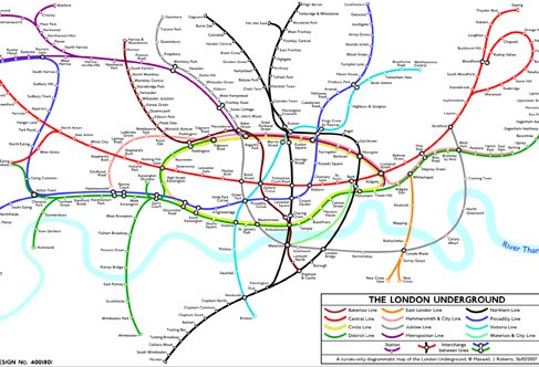
But of course the tube isn’t the only thing you’ll want to navigate. And London has been mapped for centuries well before the tube was even conceived.
Historic maps of London
John Speed
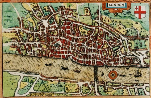
John Speed’s map of 1611 shows only the City of London – there were still patches of green fields between the City and Westminster (which has its own separate map) – and the whole of the south bank, or pretty nearly, is occupied by fields and orchards, with just a straggly fringe of houses along the river and along Borough High Street, the main road to Canterbury. Just as interesting as the map is the little view of St Paul’s from the river, with London Bridge, the Tower of London, and right in the foreground, the drum-like shapes of two theatres – one is the original Globe. It’s a colourful vision and full of interest.
John Rocque
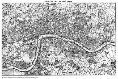
John Rocque’s map of London is quite different; its fine black and white engraving reflects the values of the Augustan age – the age of Reason. It was published in 1747 after ten years of work and is an incredibly detailed masterpiece. You can see the trees of Gray’s Inn gardens marching in their regular lines, the three-masted ships at anchor by London Bridge and every tiny alleyway of the City and the Inns of Court. The stippling of the blocks and the finely-etched capital letters suggest that London has at last been reduced to a rational plan; but the street names show a different, older and rougher London – Antelope Alley, Blowbladder Street, Chitterling Alley, Do Little Alley, Labour in Vain Yard and my favourite, Dirty Lane.
Palomar
The Crumpled City Junior map of London by Palomar couldn’t be more different from Rocque’s. Vivid colour replaces his chaste black and white and there are jolly cartoon images to amuse children, rather than the serious-minded exactitude of Rocque’s surveying. It’s a map intended to arouse interest and excitement, rather than to depict accurate geography (there’s also one important benefit that John Rocque couldn’t offer; the Crumpled City map is waterproof).
Stephen Walter
Still another view is that of the artist’s map. Stephen Walter’s The Island is a deeply personal view of London by a Londoner, gently mocking the London-centric view of the universe by making the capital an island in an English ‘sea’. It’s full of personal observations, as well as visual puns like a swaybacked Elephant at Elephant and Castle and historical references; Walter celebrates the Tottenham Outrage of 1909 and the anti-fascist campaigners of Cable Street, but also notes in Hoxton, “Nathan Barley documentary shot here”. Other annotations include “eye-sore,” “striptease zone”, “Little Turkey” (Stoke Newington), “Nonconformists, lesbians, prams” (also Stoke Newington), and “Surplus store still here!”
And just so you know, Hoxton and Shoreditch, cool home of artists and media people, is ornamented with the annotation “Beware of being a twat.”
Themed maps of London
Some aspects of London are worthy of a map in themselves. One is London’s orchards; there are very few in the City and West End (this map misses out the mulberry trees in Draper’s Gardens, near the Bank of England, though they’re not properly speaking an orchard I suppose), but there’s a surprising cluster on the South Bank, including the Archbishop’s Park orchard in Lambeth, planted just two years ago.
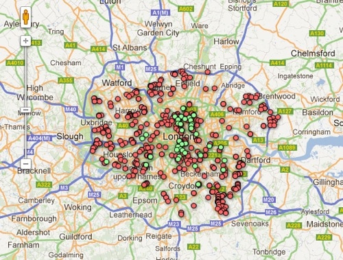
But take a look at the historic orchards map on the same site and you can see what has been lost – the whole of south London was once covered with orchards, so that the Google maps markers look like clusters of grapes hanging from the Thames like a vine.
London is not only its maps, of course. But every map is a different way of seeing the capital – a different experience of it or a different way of trying to make sense of it. Whether it’s as scientific and exact as Roque’s or as personal and opinionated as Walter’s, it’s huge fun to look at London through its maps.
This was a guest post written by Andrea Kirkby.



Hi! Your blog is amazing, nice pictures. And for me London is awesome.
If you also wanna check my new blog, please visit:
http://viajarerecordar.blogspot.com.br/
Thank you!
Signed by Viajar e Recordar